Everything You Need to Know About Responsive Website Design
When should businesses consider responsive website design to enhance their digital presence in the 4.0 era? Let’s explore this with Beau Agency in the article below.
What is Responsive Design?
In the digital product development process, the term “responsive design” has become increasingly common—and today, it’s practically a prerequisite for evaluating a website’s user experience. To fully understand responsive website design, we need to take a brief look back at the evolution of the internet and the websites that came with it.
Website Design Before Responsive Came Along
The first website was launched in 1991. In the following years, hundreds of thousands more were created. These early websites were typically designed with a fixed width—usually 800px or 1024px—because those were the most common desktop screen sizes at the time. Designers created websites strictly for desktop browsing, and the design stayed the same regardless of the device being used.
But clearly, you can’t browse a 1024px layout on a legendary Nokia E63 with a 320×240 screen resolution. As more users accessed the internet on mobile devices of various sizes and resolutions, these fixed-width designs quickly became outdated. Not only users but designers too began seeking ways to create layouts that could adapt seamlessly across different screen sizes.
The Rise of Mobile Devices
The 20th century saw a boom in mobile technology. Early on, these devices could only handle text-based data. By the mid-21st century—particularly after the first iPhone was released in 2007—users finally experienced websites that were truly built for mobile, thanks to the power of CSS2 and JavaScript.
Still, mobile web browsing in this era wasn’t ideal. Pages were slow to load on 2G or 3G connections, and navigating with a finger lacked the precision of a mouse, leading to frequent misclicks. Though mobile web use was growing, the experience left much to be desired.
This growing demand for a better mobile browsing experience spurred the development of a new approach: a technology that would automatically and intelligently adjust the layout, text size, and images to fit any device screen.
The Birth of Responsive Website Design
The term “Responsive Web Design” was coined by Ethan Marcotte, who highlighted the surge in mobile web users and proposed a future-proof solution: responsive design.
Initially, mobile web design meant creating a completely separate version of a site, often known as a WAP (Wireless Application Protocol) design. These mobile versions had their own domains and layouts customized for mobile interfaces.
But in a 2000 usability study in London, UX experts from the Nielsen Norman Group revealed that WAP designs were clunky—simple tasks like reading a headline or checking the weather took too long. Poor screen sizes and slow connections further worsened the user experience.
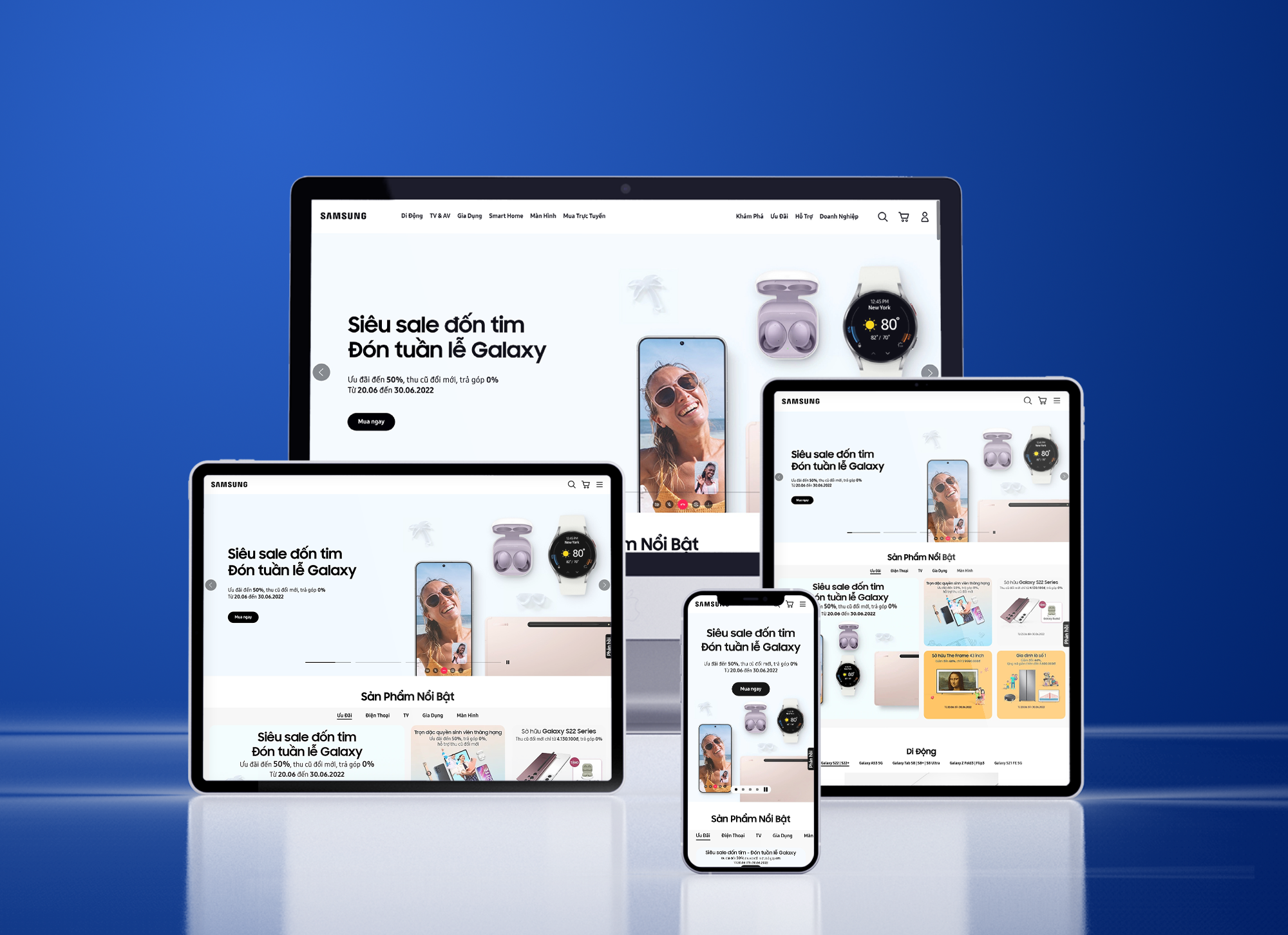
To satisfy users across all devices, the solution wasn’t to keep creating separate versions, but rather to design one version that adapts automatically—a responsive website. RWD (Responsive Web Design) introduced a unified approach: one domain, one codebase, for all devices—from smartphones and tablets to laptops and desktops.
Optimizing Responsive Website Design for User Experience
From the start, responsive design proved far superior to WAP. By using a single codebase and domain, design and setup costs are greatly reduced. Content managers no longer need to juggle multiple versions of a website, freeing up time and budget for higher-value work.
For users, responsive design provides seamless, high-quality experiences across devices. Mechanically, RWD detects the user’s device and automatically adjusts the layout based on screen size, resolution, operating system, and orientation.
According to StatCounter, nearly 55% of global web traffic now comes from mobile devices, compared to less than 43% from desktops. This means businesses that don’t optimize for mobile responsiveness risk losing valuable traffic—and potentially, customers.
On desktop, you can go full-width or full-container. But when adapting to narrower, vertical screens, the layout must reconfigure intelligently. Thankfully, with tools like Bootstrap CSS3 and other modern frameworks, responsive coding has become much more streamlined. Developers now set breakpoints—specific screen sizes at which the design layout shifts automatically to optimize for the user experience.
In recent years, alongside the rise of Responsive Web Design, another approach has gained significant attention: Mobile-First Design. As the name suggests, mobile-first is a design philosophy focused on delivering a better user experience by starting with mobile optimization.
This approach prioritizes core user experience elements on smaller screens, ensuring that information is clearly presented within limited space. Once the mobile version is fully optimized, the design is then progressively enhanced for larger screens like tablets and desktops.

Grids and Layouts in Responsive Web Design
Grids are the fundamental building blocks of website layouts. The most commonly used grid system today is the 12-column grid on desktop. The choice of 12 columns is intentional—it offers great flexibility and divisibility, making it easier to adapt layouts across various screen sizes. As screen dimensions shrink, the 12-column layout can seamlessly transform into 8-column, 6-column, 4-column, or even a single-column layout.
For example, if you design a grid layout with four cards on a 12-column grid, each card would occupy 3 columns, forming a 4×1 layout. On a 6-column mobile grid, those same cards could rearrange into two rows of two (2×2) or even four rows of one (1×4), depending on the screen size and responsive breakpoints.

To ensure a website design is fully responsive, designers must understand the flexibility of frameworks like Bootstrap. This not only reduces the complexity for developers during implementation but also helps avoid layout errors when adapting to different screen sizes.
In addition, maintaining content hierarchy is crucial when designing responsive layouts. Large visual sections that take up 1.2x the viewport height or the full screen on desktop must be carefully adjusted on mobile. This often means increasing the vertical height of the section and scaling up the text size to preserve the same visual weight and impact as seen on larger screens.

Designers should also develop a mindset for flexibly transforming layouts when adapting to responsive design. One effective strategy is to incorporate special sections that are tailored for mobile experiences. Due to the limited screen space, users typically need to scroll and swipe more frequently on mobile compared to just a few scrolls on desktop. By recognizing this behavioral difference, designers can turn static content sections—such as simple lists on desktop—into interactive, engaging elements on mobile. This approach not only optimizes screen space and avoids overwhelming layouts, but also enhances user experience through continuous interaction and emotionally engaging animations.

Responsive Navigation
If the layout forms the structural backbone of a design, then navigation functions like the nervous system, connecting every element to shape a seamless user journey. Just like its desktop counterpart, mobile navigation must guide users toward their goals in the fastest, most intuitive, and fluid way possible.
Effective navigation enhances usability, evokes emotional engagement, and drives users to explore all the features your product offers. Conversely, poor navigation makes it difficult for users to find what they need and may result in disjointed experiences the product team never intended.
One of the most common responsive design challenges designers face is handling the menu. With the limited screen space on mobile, displaying a full menu isn’t practical. That’s why the navigation bar is usually condensed into a single icon (often the hamburger icon)—a clear, intuitive signal that lets users access the full menu with just one tap, keeping the interface clean without sacrificing usability.
In responsive design, cards are among the most commonly used elements. Not only do they help declutter the layout, but they also improve content organization by clearly separating information into well-defined, recognizable containers. This “framing” effect makes it easier for users to process content quickly.
Another key advantage of using cards is their ability to provide intuitive visual cues about how content is arranged—indicating whether users should scroll horizontally or vertically to explore more. On mobile devices especially, responsive card layouts encourage user interaction, making the browsing experience more engaging and dynamic.
Another key element often found in responsive web design is the use of tabs. Tabs are an effective way to organize content of the same hierarchy, with each tab containing a related group of information. Whether on desktop or mobile, the structure of tabs generally remains consistent—users simply tap or click on each tab label to view the corresponding content.
This approach not only keeps the interface clean and compact, but also allows users to navigate between content sections easily, without overwhelming them with too much information at once.
Typeface: Website Responsive
With the rapid advancement of hardware, screen resolutions are constantly improving. Today, it’s not uncommon for smartphones to have 2K or even 4K screens. However, imagine transferring a running text with a 16pt font size—considered normal on a 1920×1080 computer screen—onto a mobile screen with the same resolution. Due to the smaller size of mobile screens, the text will appear much larger.
Therefore, to properly manage responsive design, we need to consider not just screen resolution but also screen size. In CSS, there are two types of measurement units: absolute units and relative units.
Absolute Units
Absolute units are familiar to designers and include px (pixels) and pt (points). A pixel (px) represents a single point on the screen, and a point (pt) is defined as 1 inch = 72 points. These units are fixed and do not change regardless of the screen size or resolution, making them easy to measure and predict.
Relative Units
Relative units are more familiar to developers and include %, em, and rem. As the name suggests, these units are used for settings that are not fixed and are influenced by external factors such as screen size and resolution, as well as how the browser renders the design based on the code. Simply put, when using relative units, the size of elements will be calculated as a function of these units. The design will adapt dynamically based on the px values set for these relative units.
When Should You Consider Responsive Web Design?
When should you prioritize responsive design? The answer is always, as it depends on the needs of each project. At Beau Agency, we always implement responsive design after the desktop version has been finalized. Our designers follow the art direction proposed to clients but are always ready to customize each section and element specifically for the mobile version to ensure the most comfortable user experience. By using tools like Figma mirror, we ensure that the design and preview process is continuous, allowing for careful adjustments to be made in real-time to ensure the design is refined and perfected.


